
Rebecca Leonora
Cases
"Design in progress.. driven by users, fueled by growth.”
Back to Designs
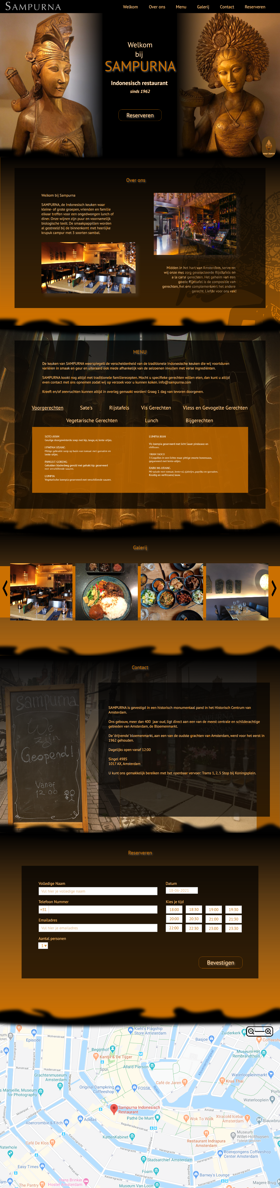
Redesigning the Sampurna Restaurant Website
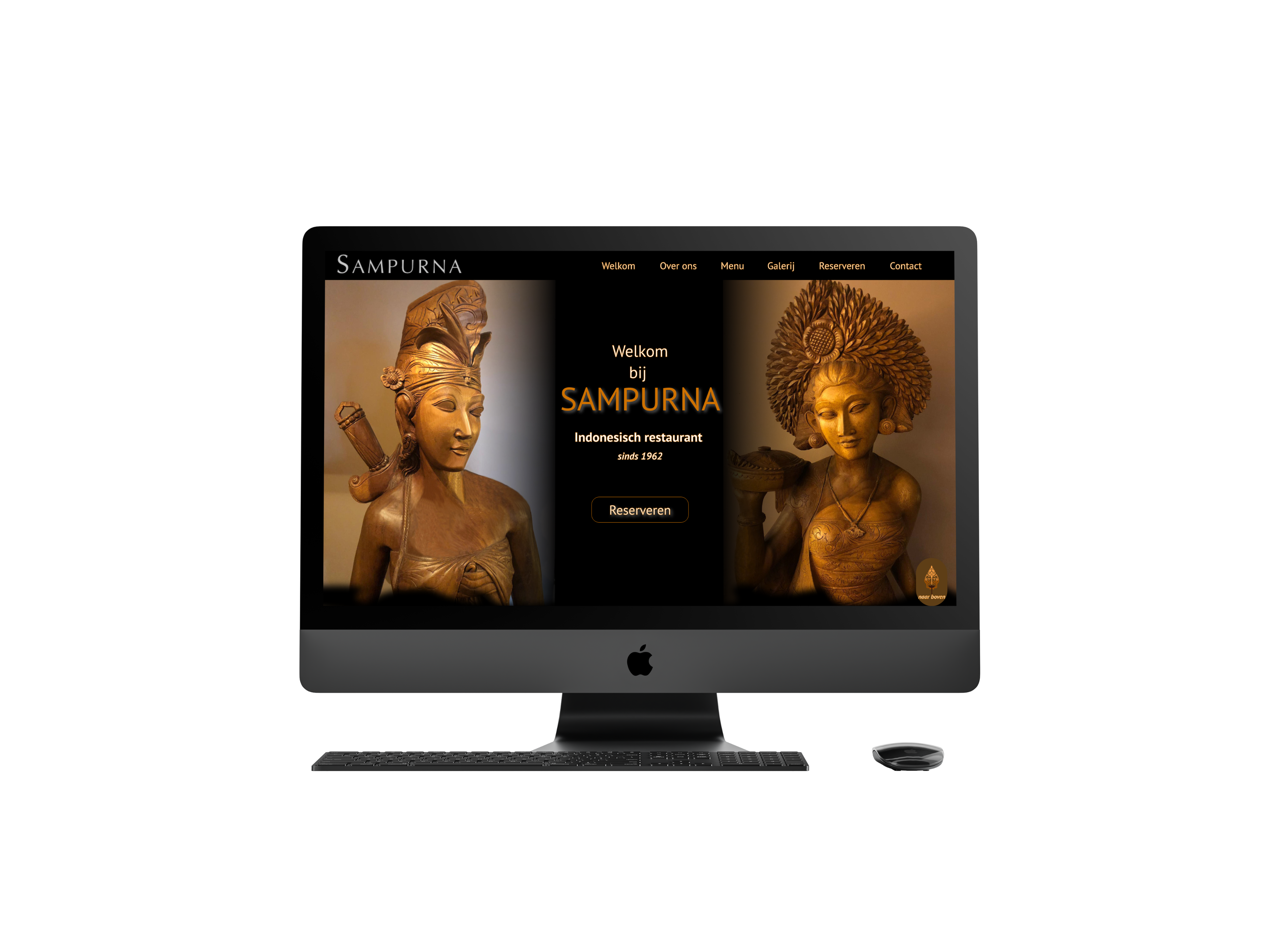
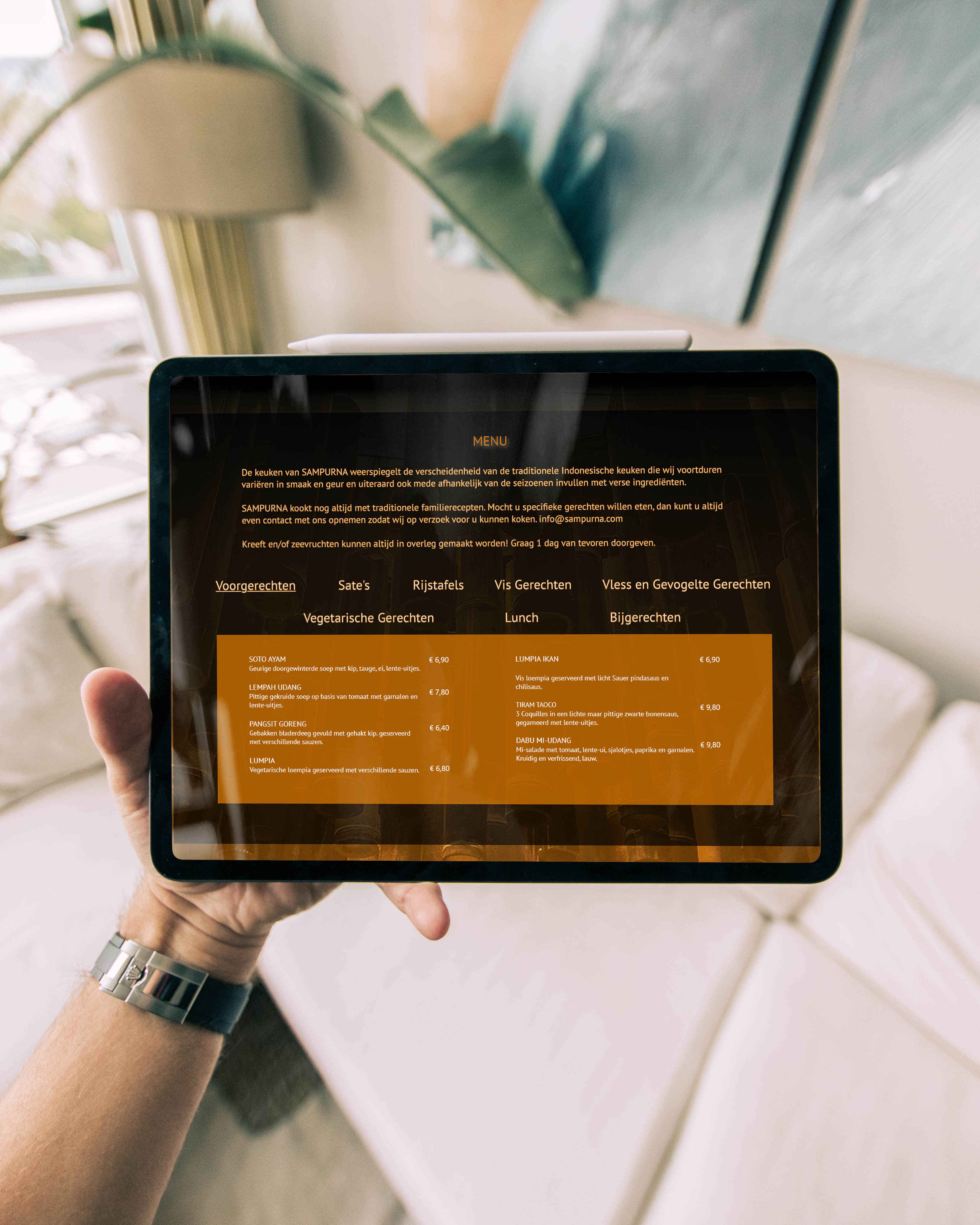

Everything in one smooth scroll.
All content, from the welcome message and menu to location and contact, is accessible within a single, clean page. This keeps the experience fast, focused, and mobile-friendly.
Rebecca Leonora
Cases
"Design in progress.. driven by users, fueled by growth.”
Back to Designs
Redesigning the Sampurna Restaurant Website
Everything in one smooth scroll.
All content, from the welcome message and menu to location and contact, is accessible within a single, clean page. This keeps the experience fast, focused, and mobile-friendly.