
Rebecca Leonora
Cases
"Design in progress.. driven by users, fueled by growth.”
Back to Designs
Redesigning Correct Webshop
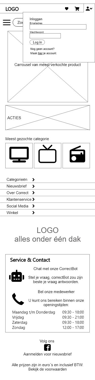
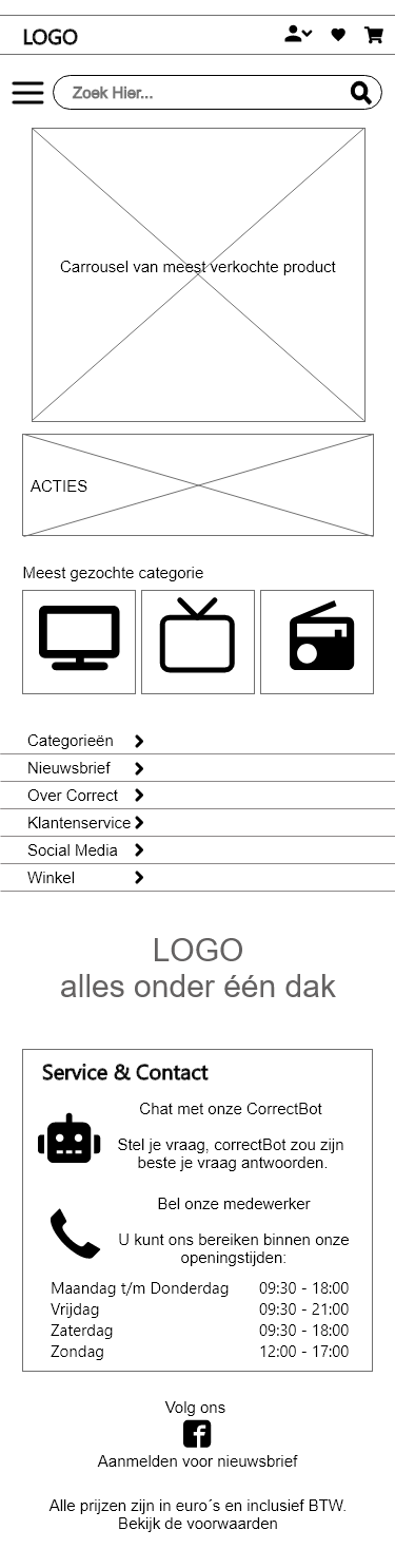
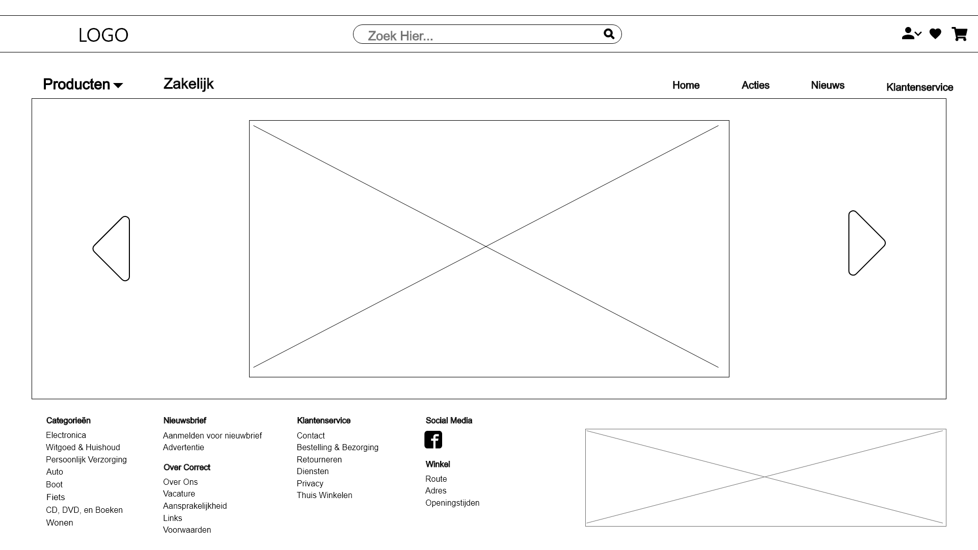
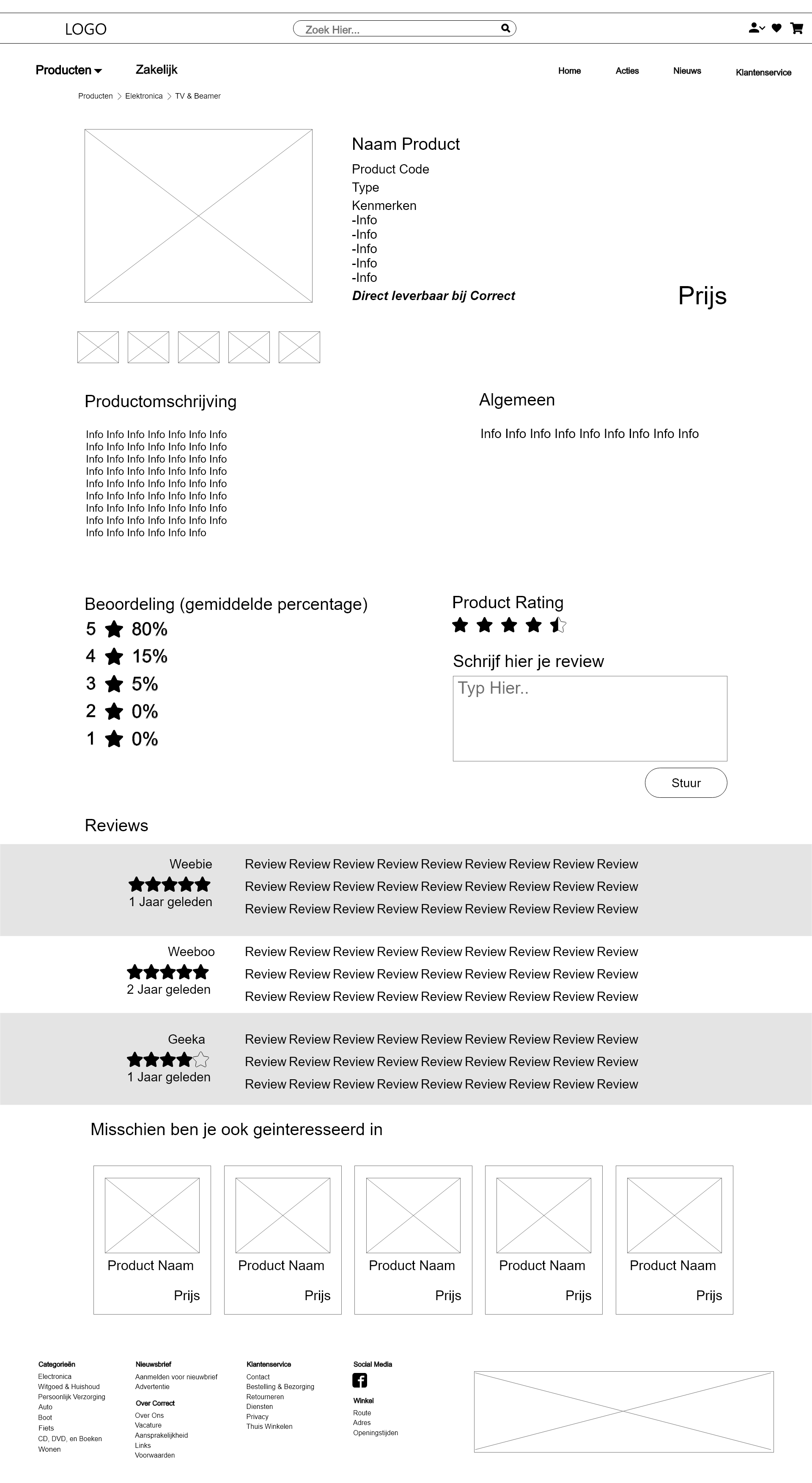
Built for clarity and conversion.
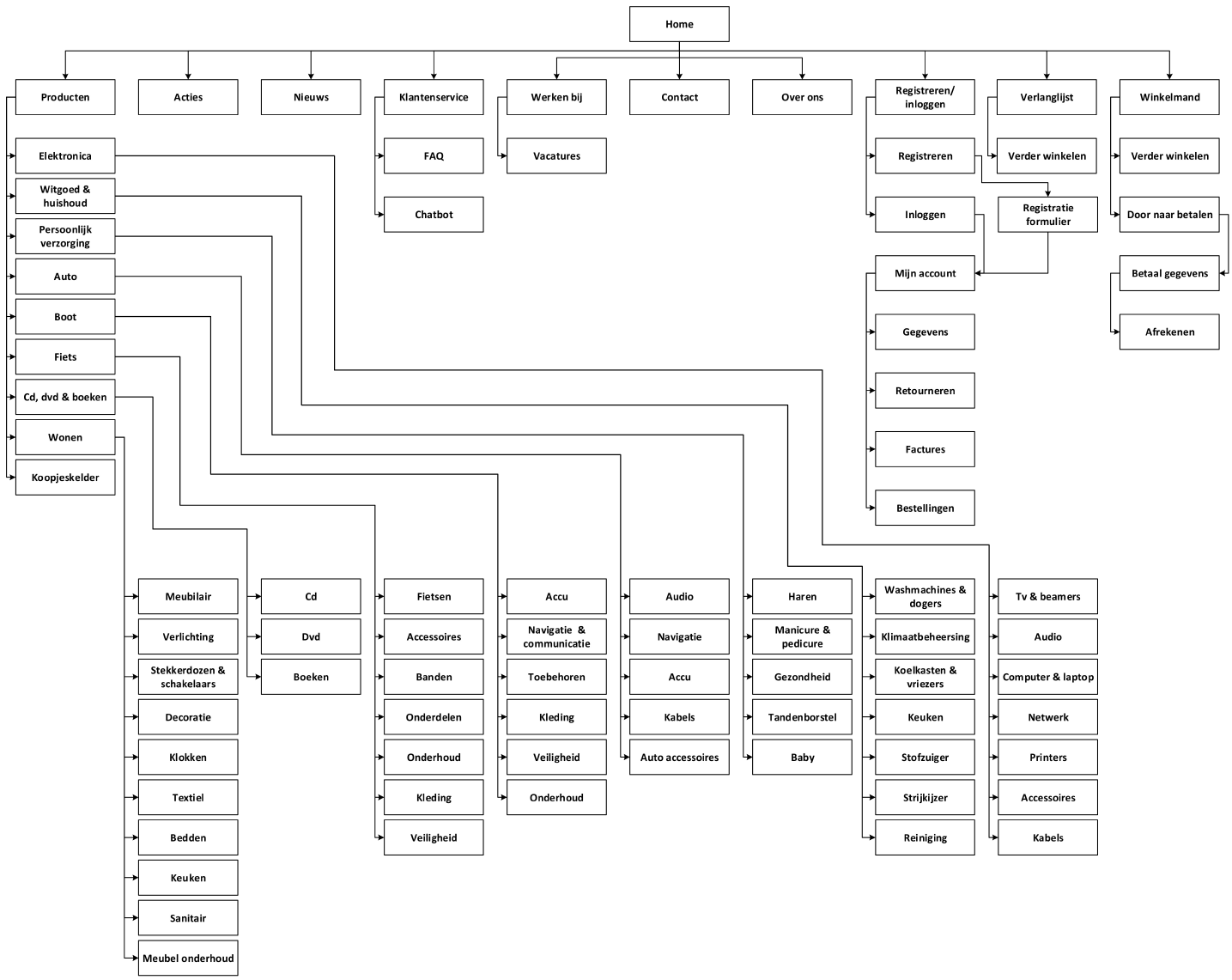
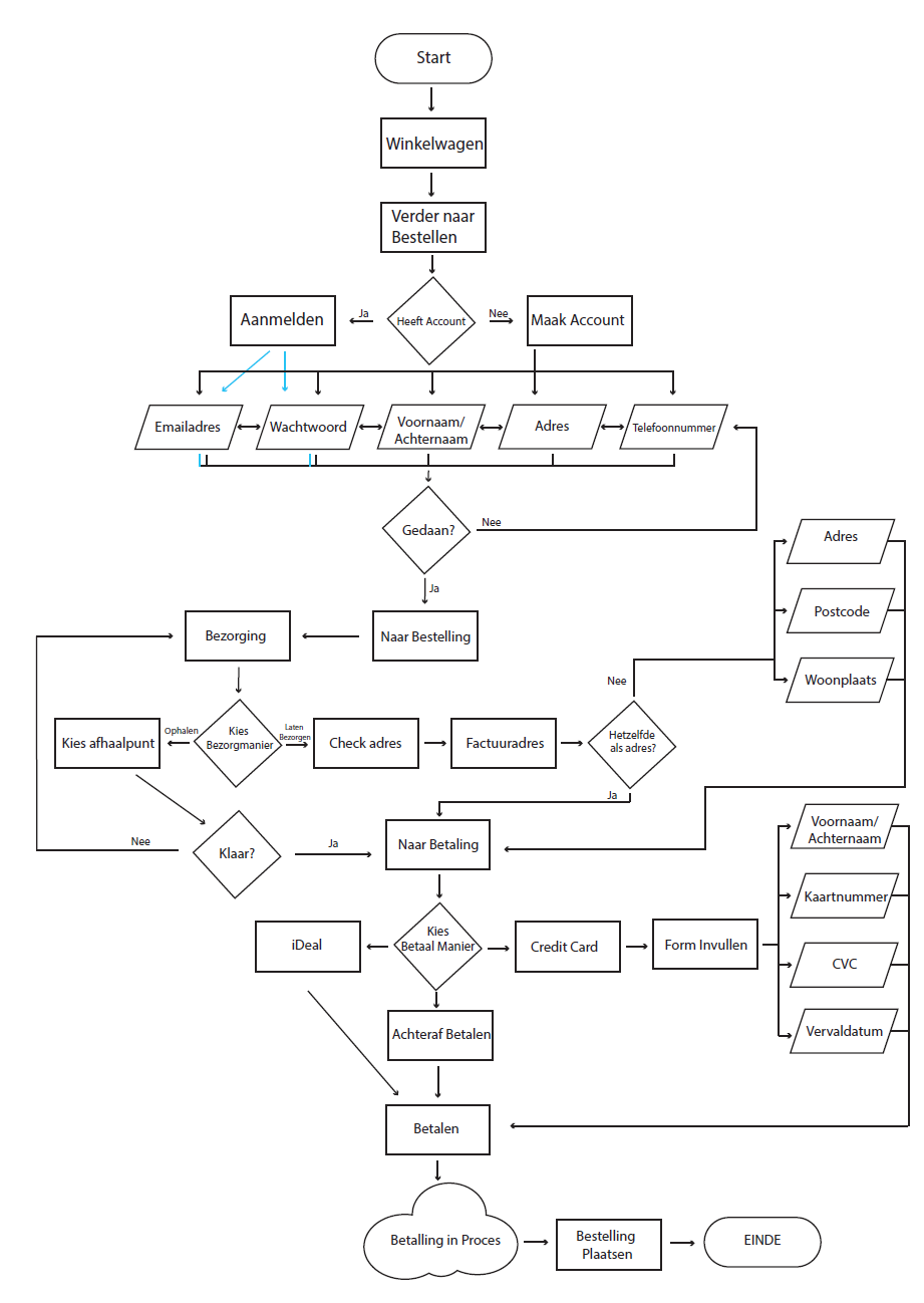
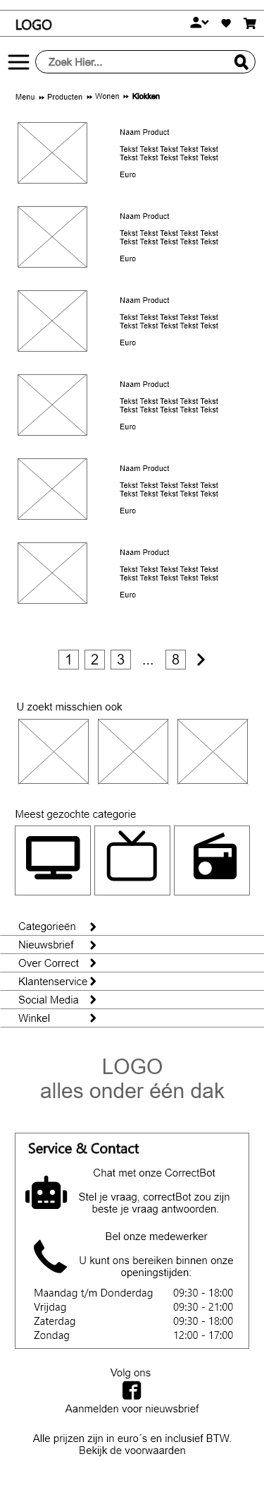
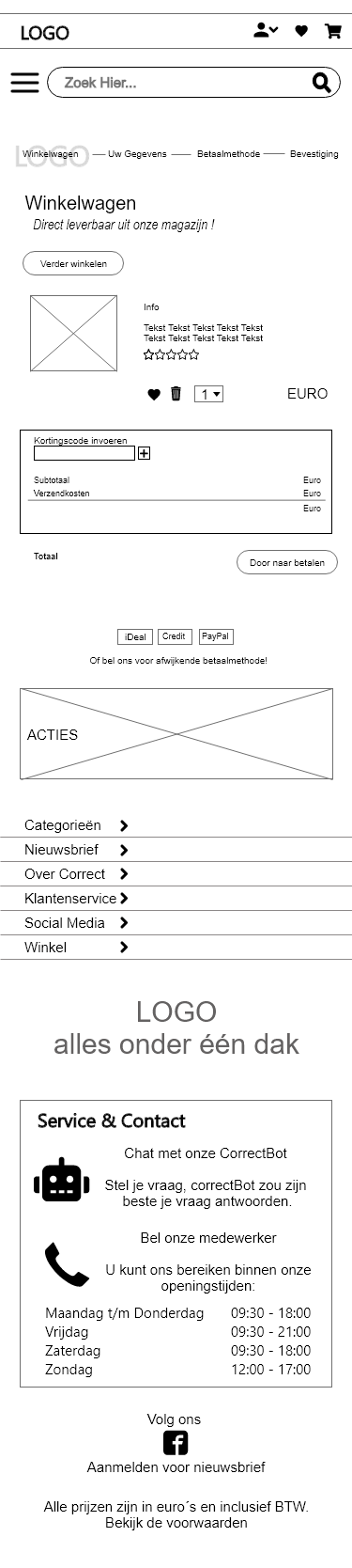
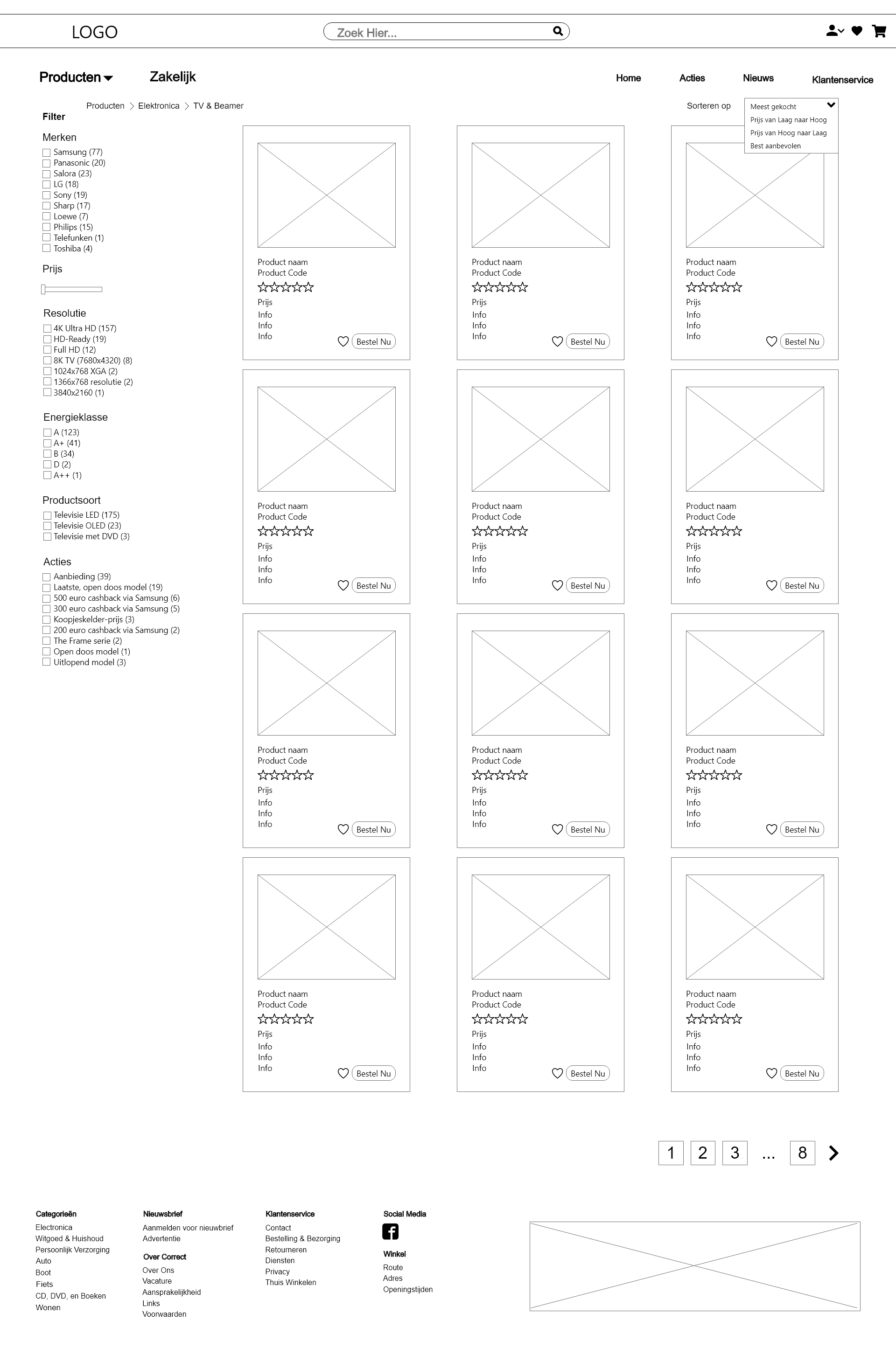
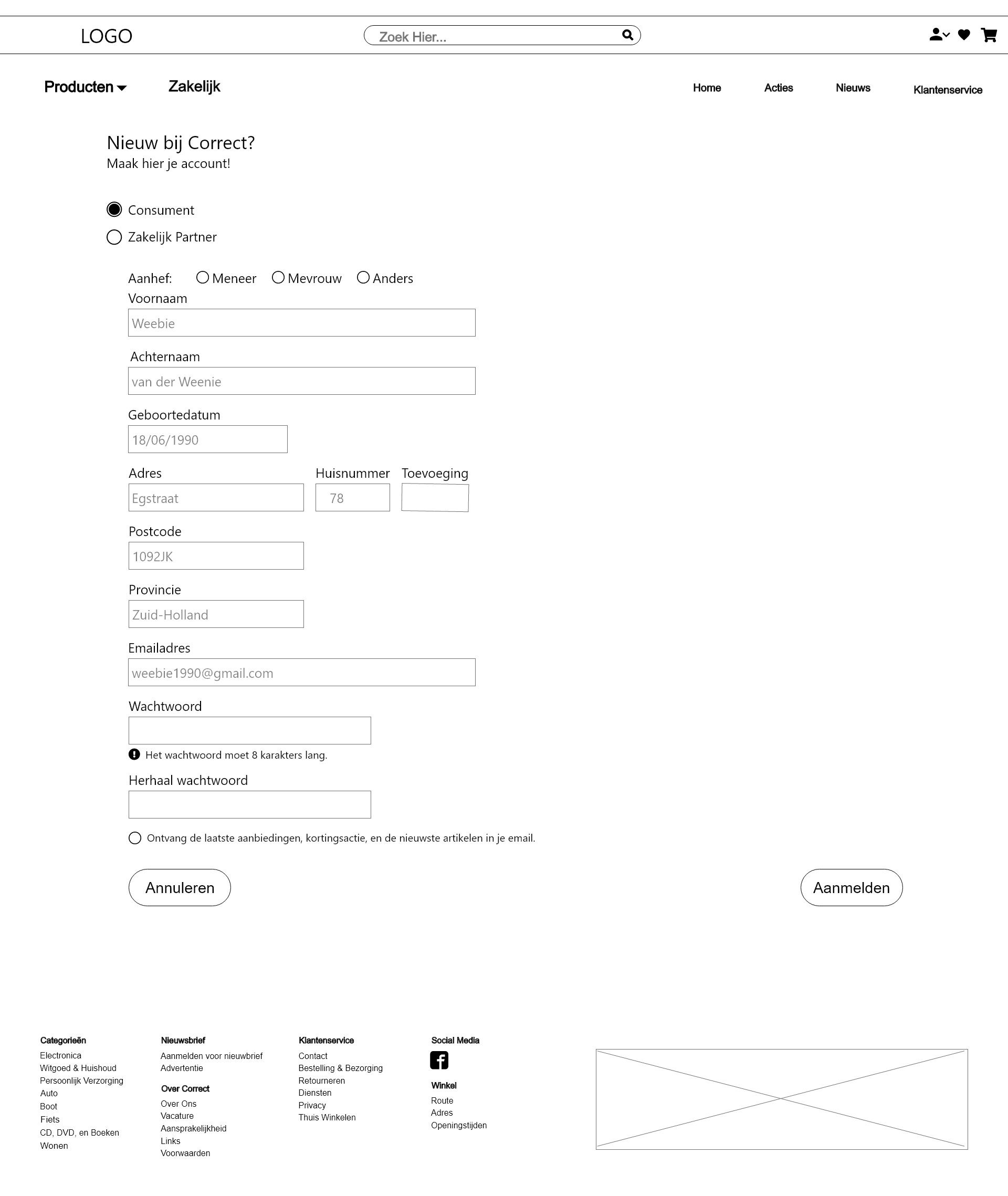
The wireframes focused on simplifying complex shopping steps. Key actions like comparing products, checking details, or adding to cart were made faster and more intuitive, based on common user flows and testing insights.
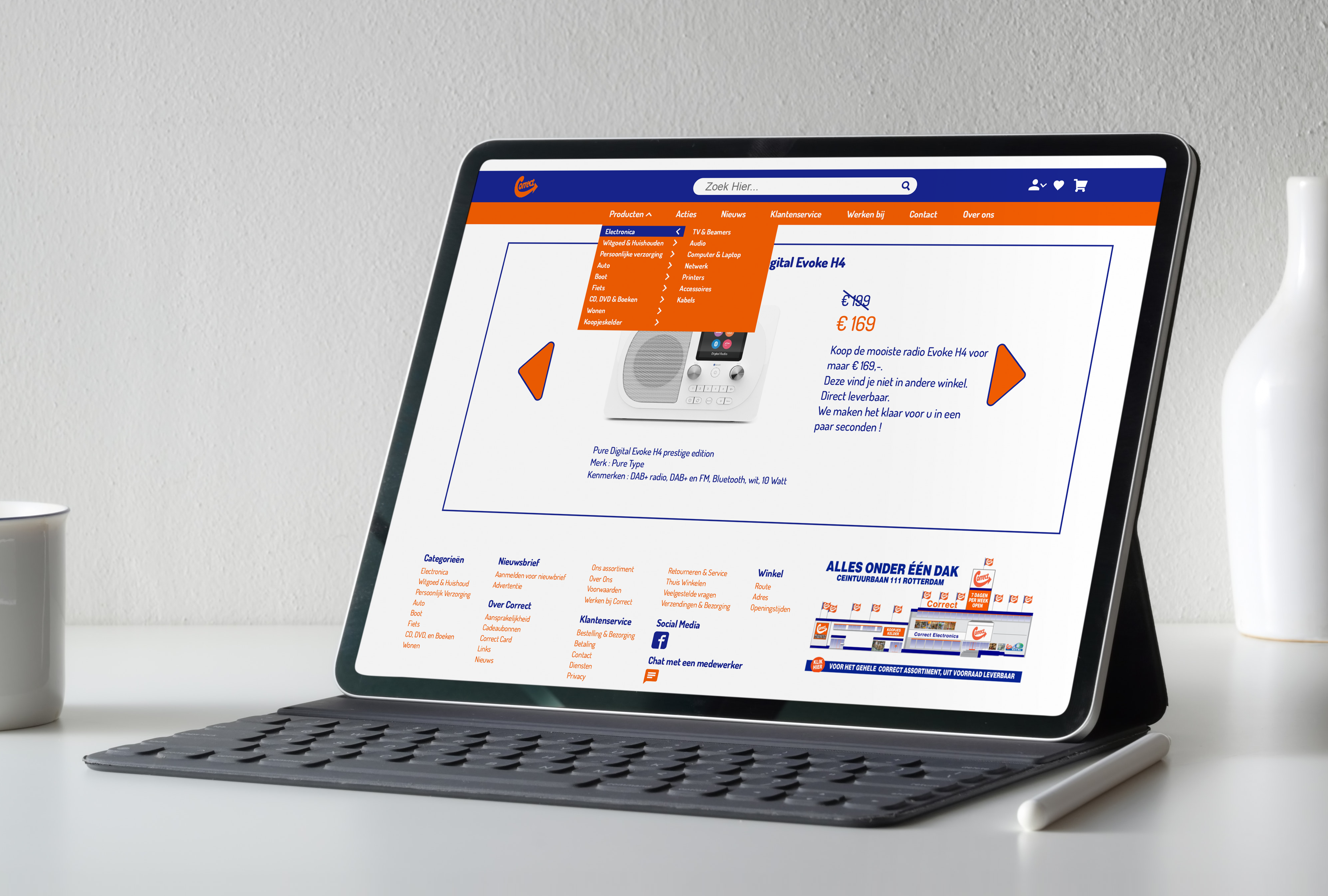
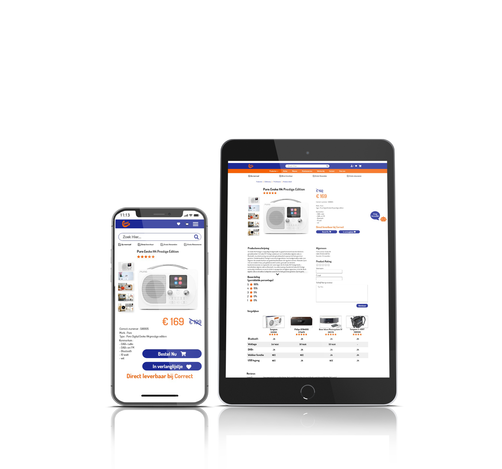
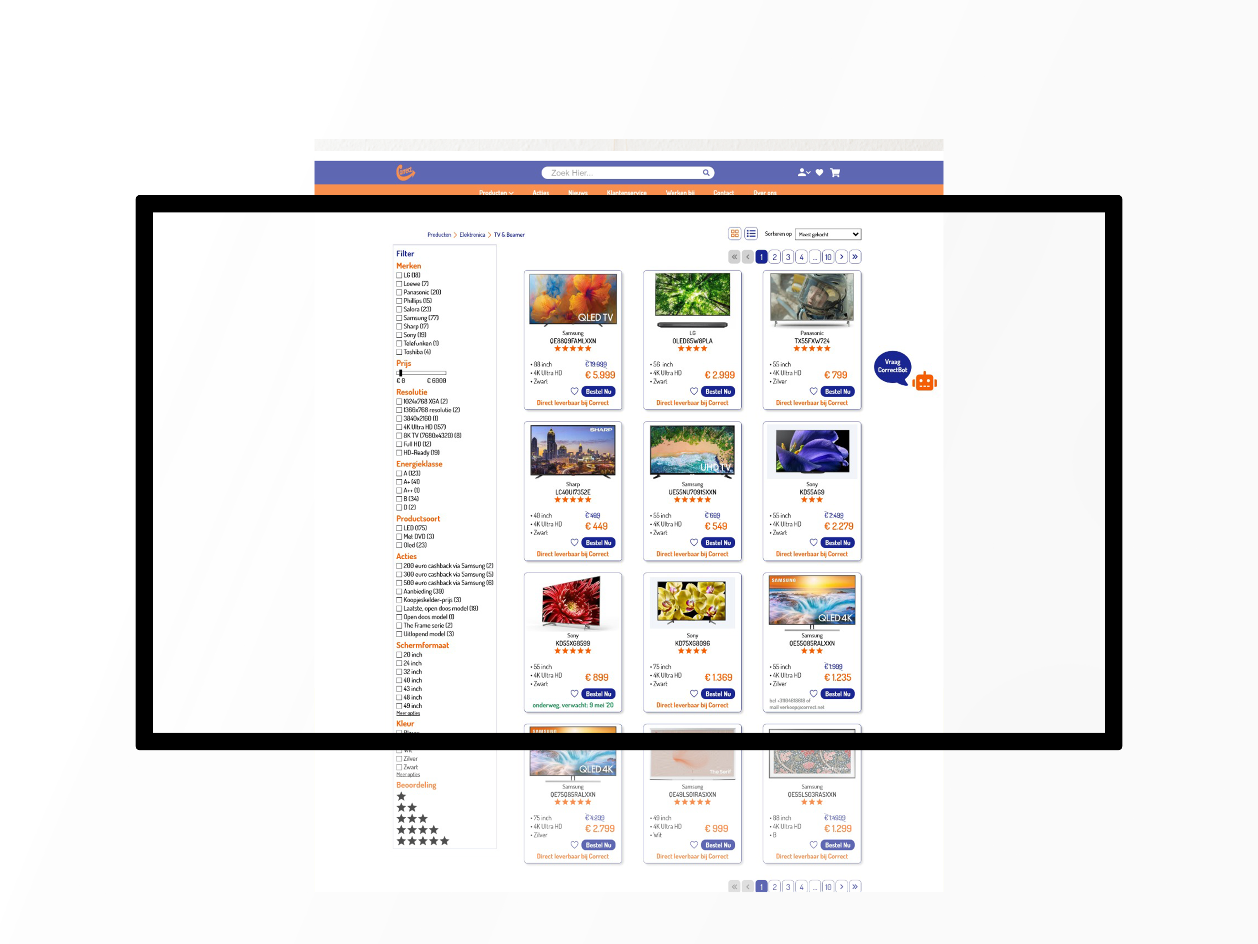
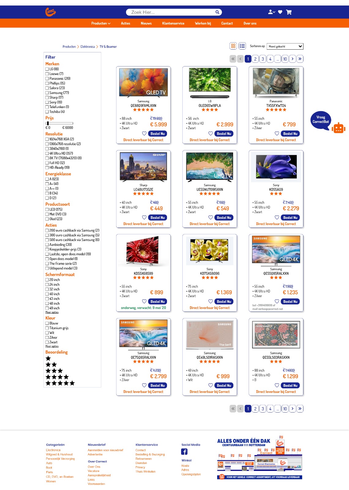
Polished screens that reflect the final user experience.
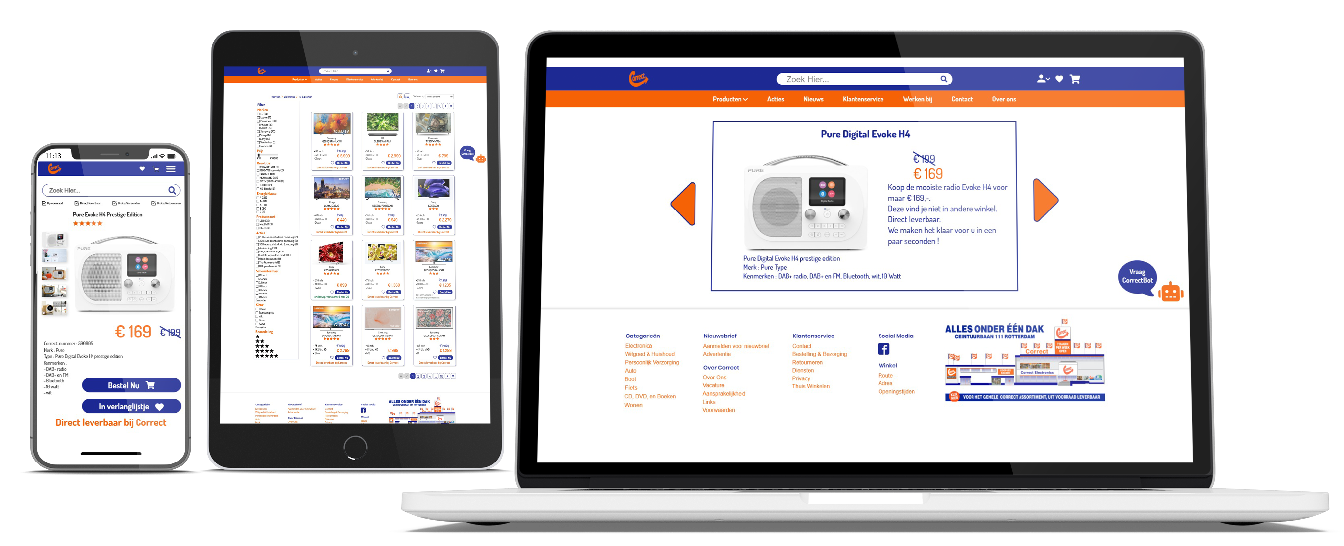
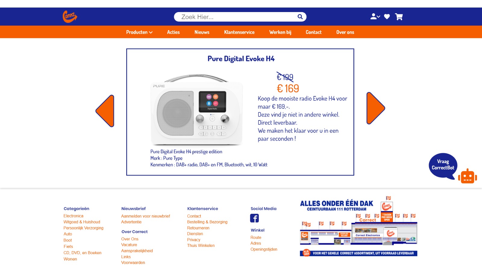
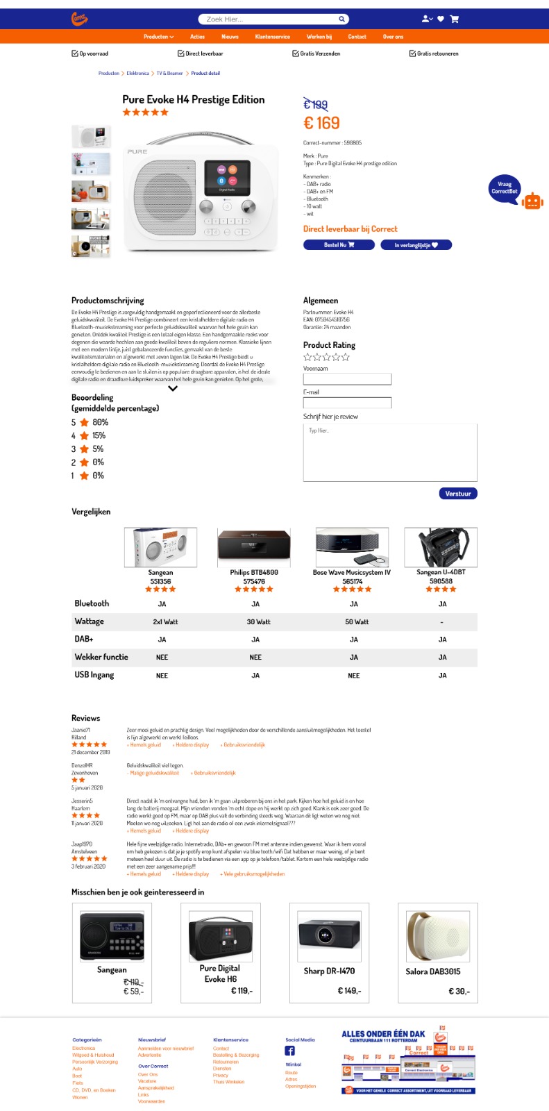
The high-fidelity pages combine functionality and visual design, showcasing the final look, interaction patterns, and branding. Every detail was refined to ensure clarity, consistency, and ease of use across all user tasks.

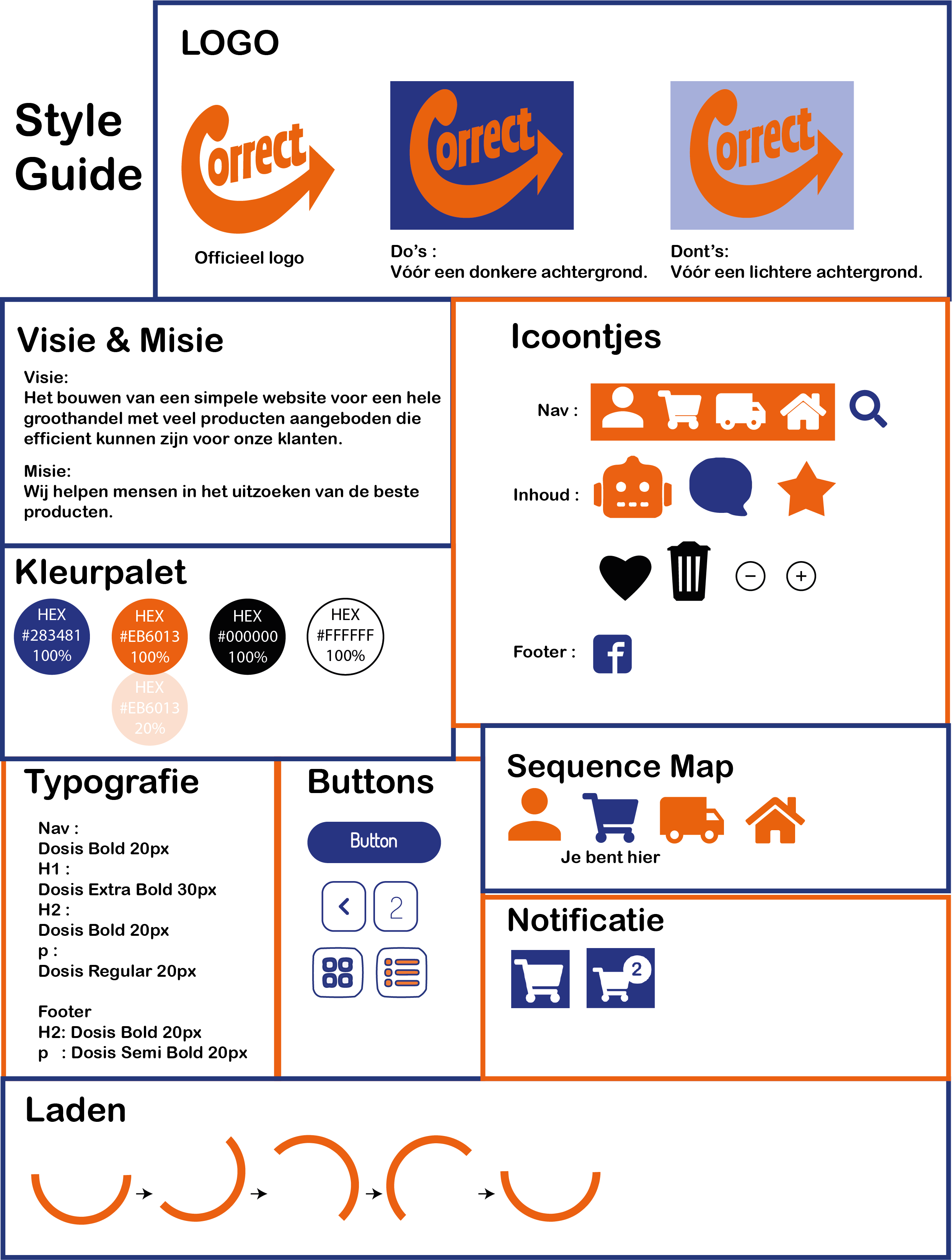
Consistent elements with refined details.
Core components were kept in line with the brand's visual identity. Icons, loading animations, and typography were refined to improve readability, speed perception, and visual consistency across the platform.
Rebecca Leonora
Cases
"Design in progress.. driven by users, fueled by growth.”
Back to Designs
Redesigning Correct Webshop
Built for clarity and conversion.
The wireframes focused on simplifying complex shopping steps. Key actions like comparing products, checking details, or adding to cart were made faster and more intuitive, based on common user flows and testing insights.
Polished screens that reflect the final user experience.
The high-fidelity pages combine functionality and visual design, showcasing the final look, interaction patterns, and branding. Every detail was refined to ensure clarity, consistency, and ease of use across all user tasks.
Consistent elements with refined details.
Core components were kept in line with the brand's visual identity. Icons, loading animations, and typography were refined to improve readability, speed perception, and visual consistency across the platform.