
Rebecca Leonora
Cases
"Design in progress.. driven by users, fueled by growth.”
Back to Designs
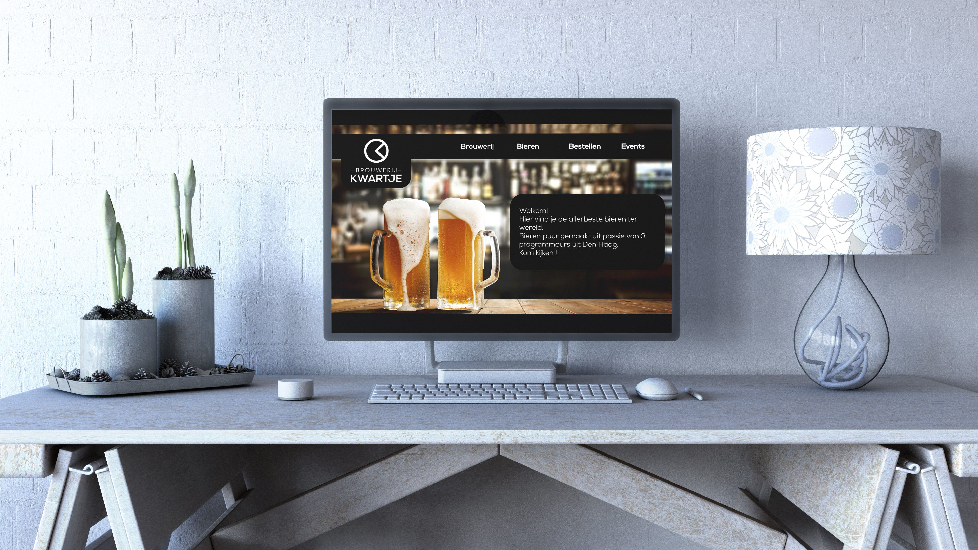
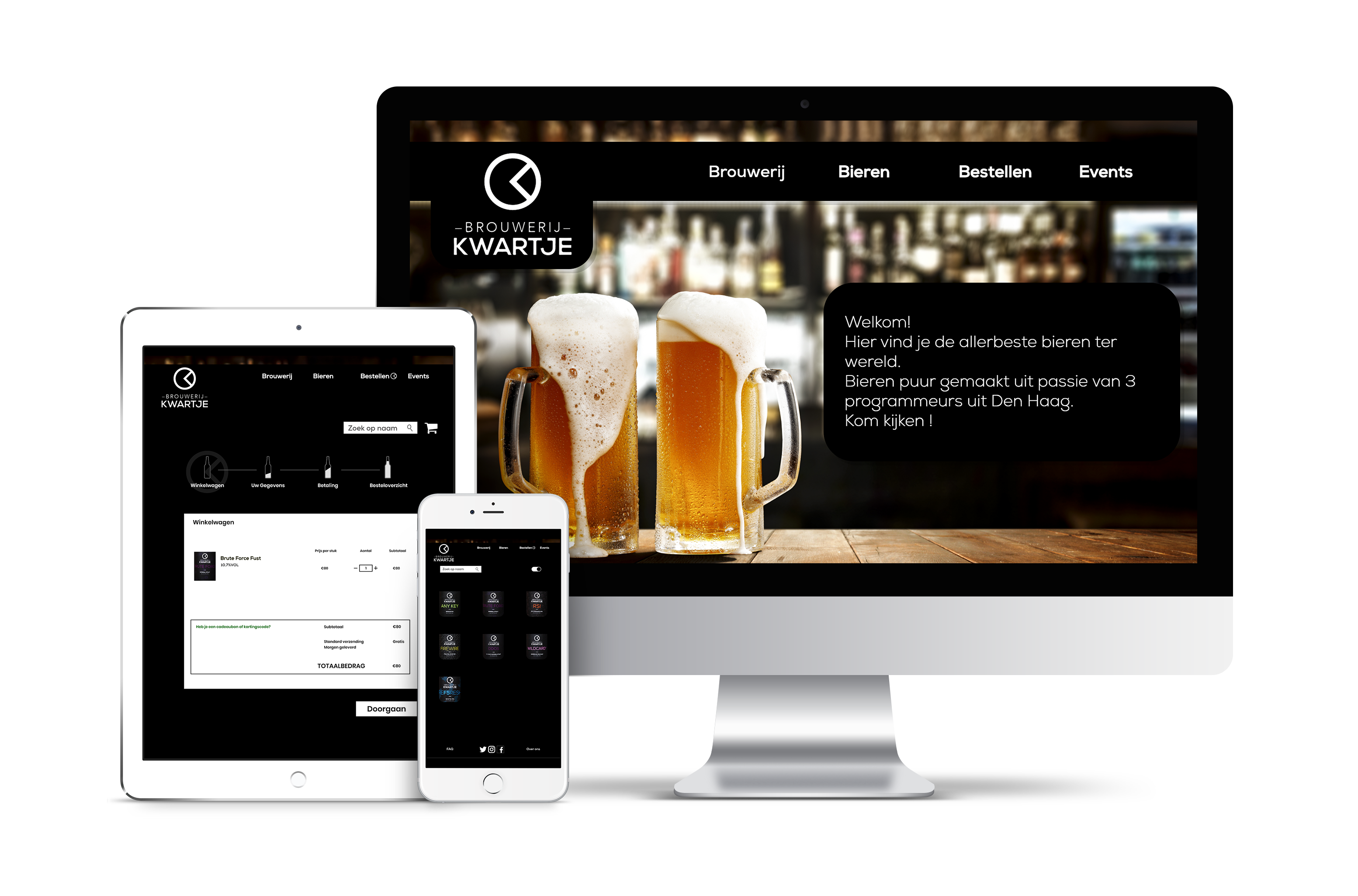
Redesigning the Local Beer Brewery Webshop
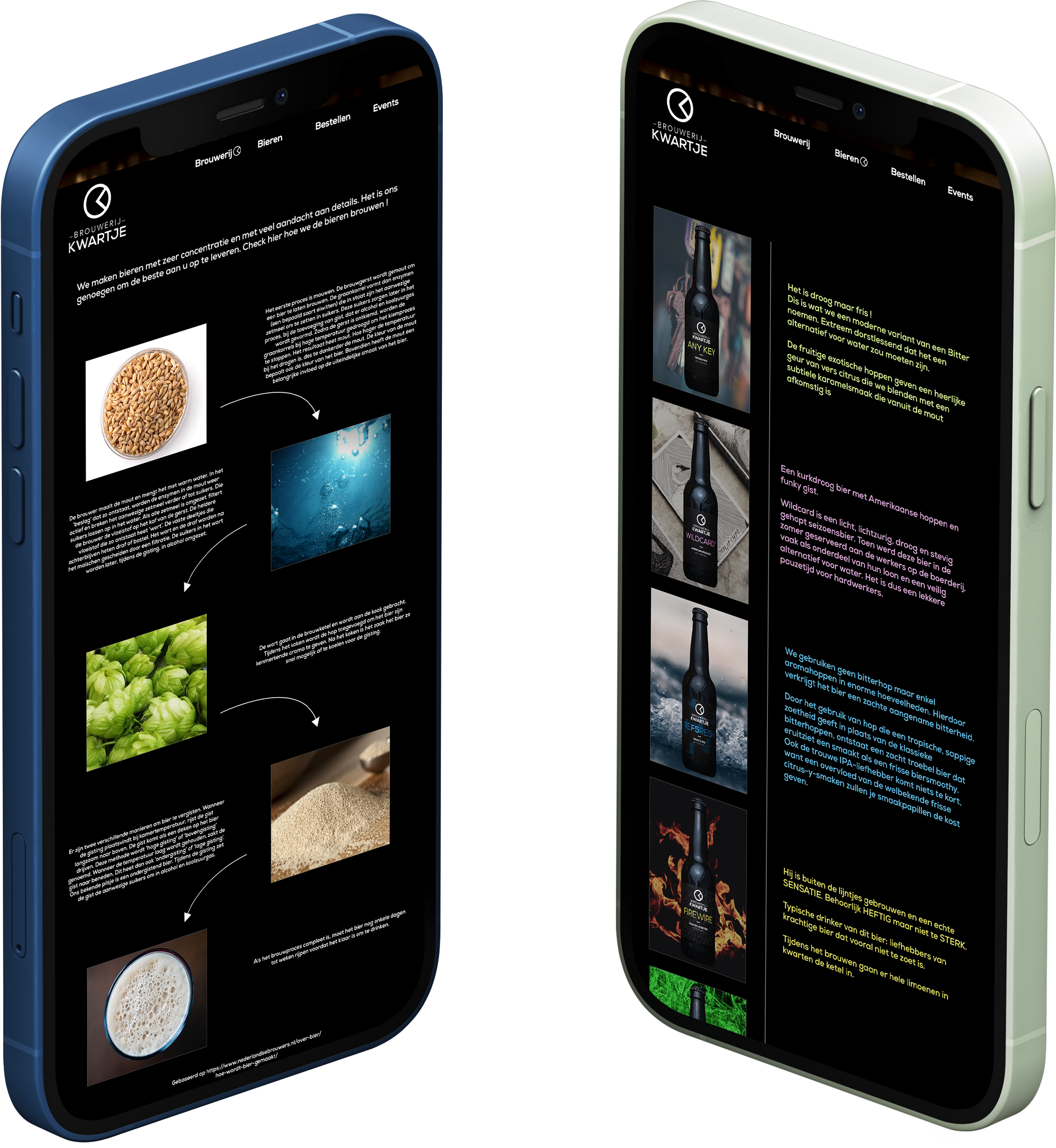
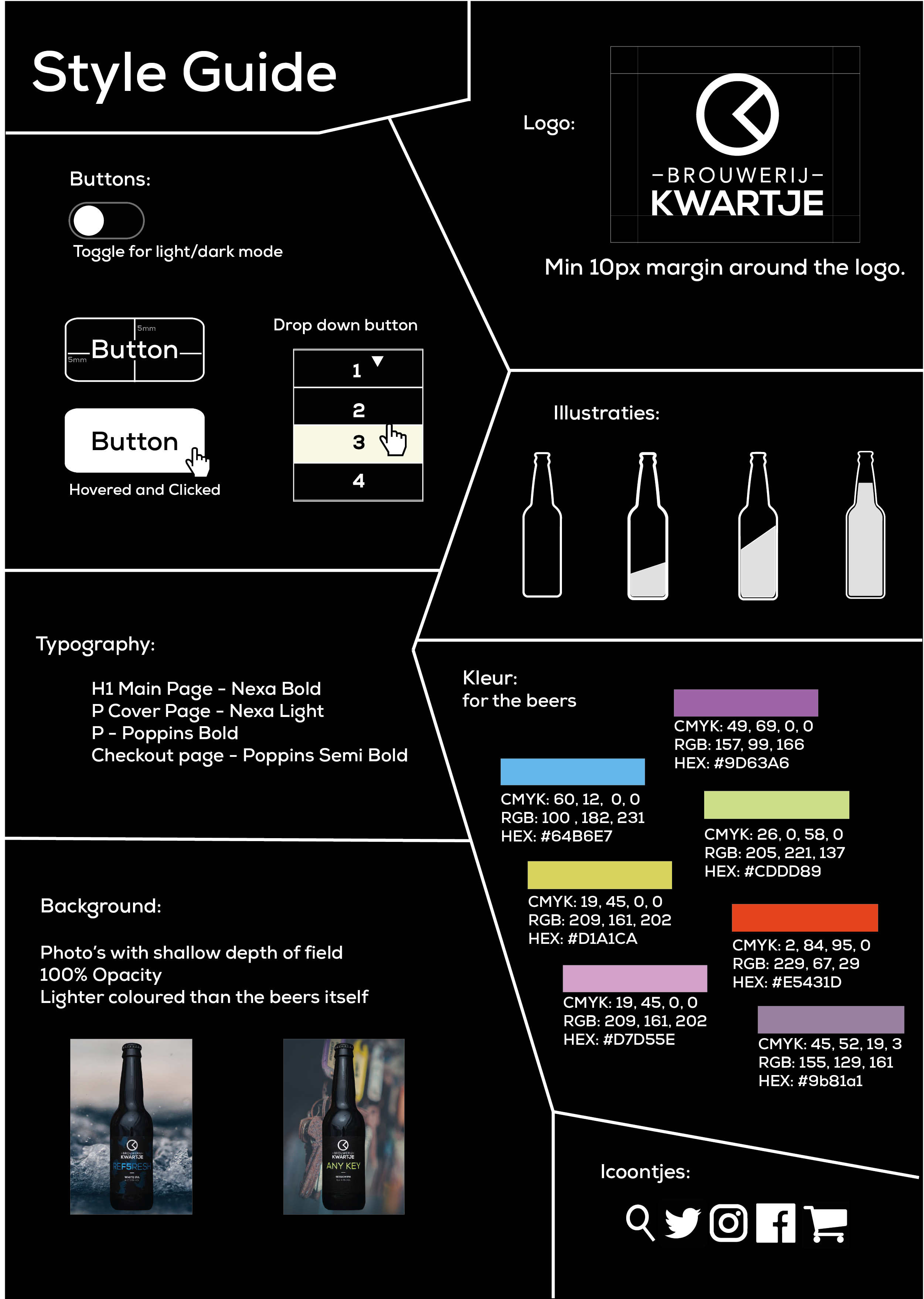
Tailored storytelling and sequence-based visuals.
Each beer type is presented with its own section and feel. The purchasing journey is visually mapped using sequences, helping users understand the steps with minimal confusion.

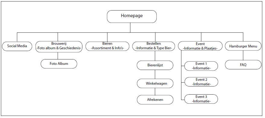
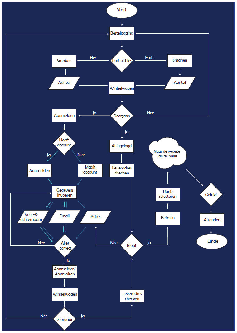
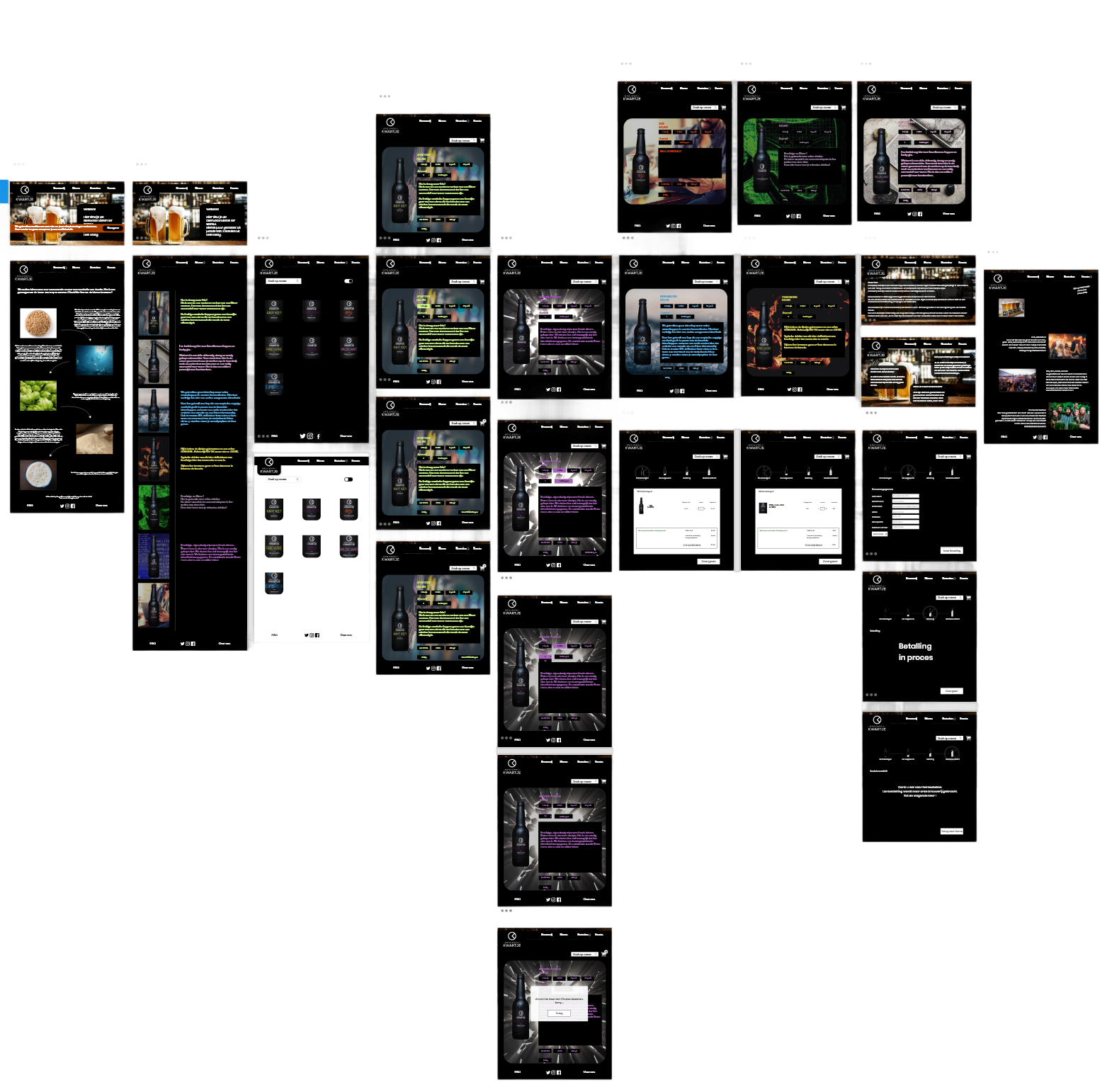
A detailed logic behind a working webshop.
A compact sitemap supported by a well-thought-out flowchart outlines all possible interactions. Every step, from discovery to checkout, was carefully designed and mapped.
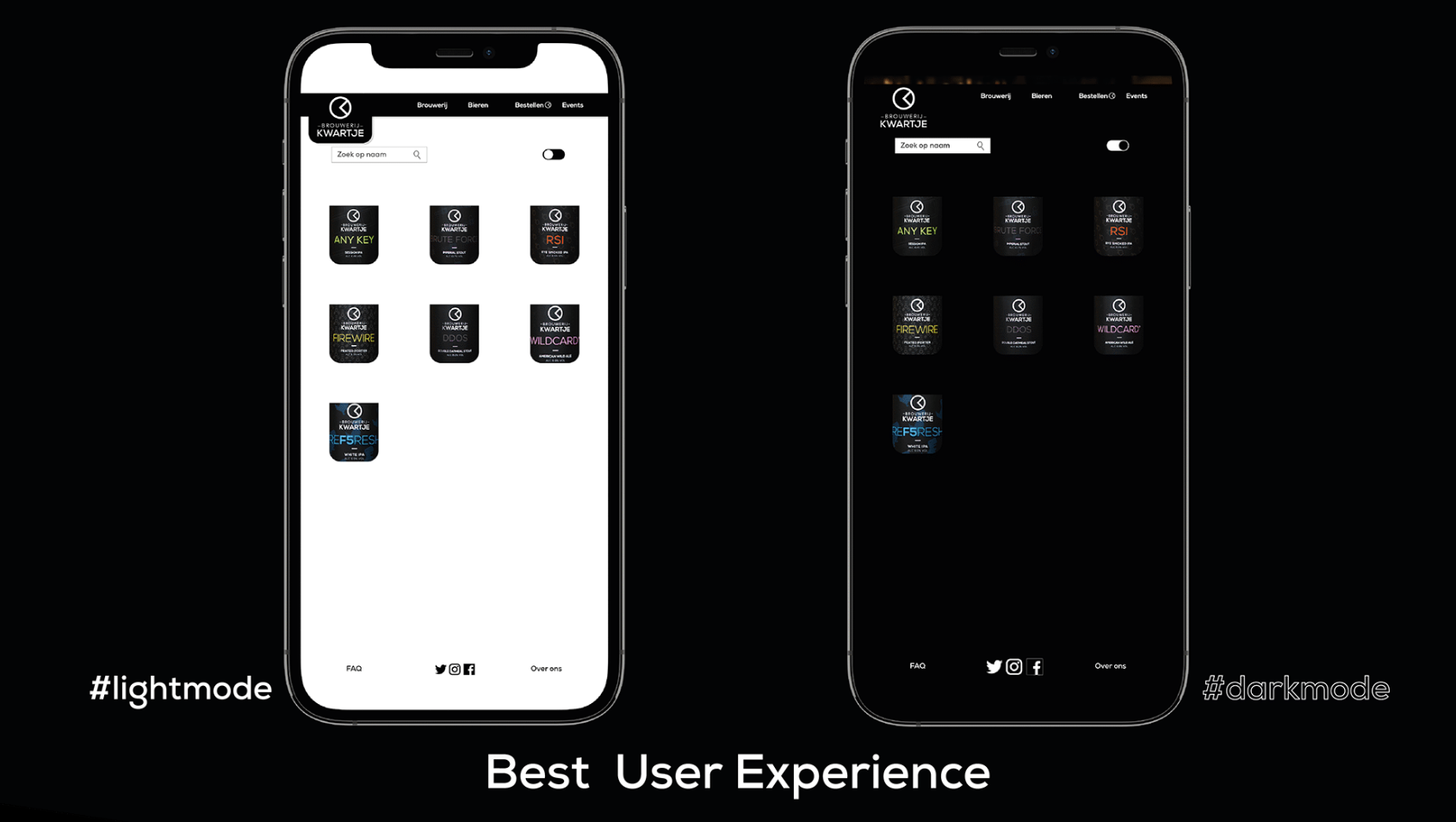
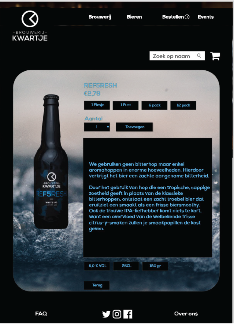
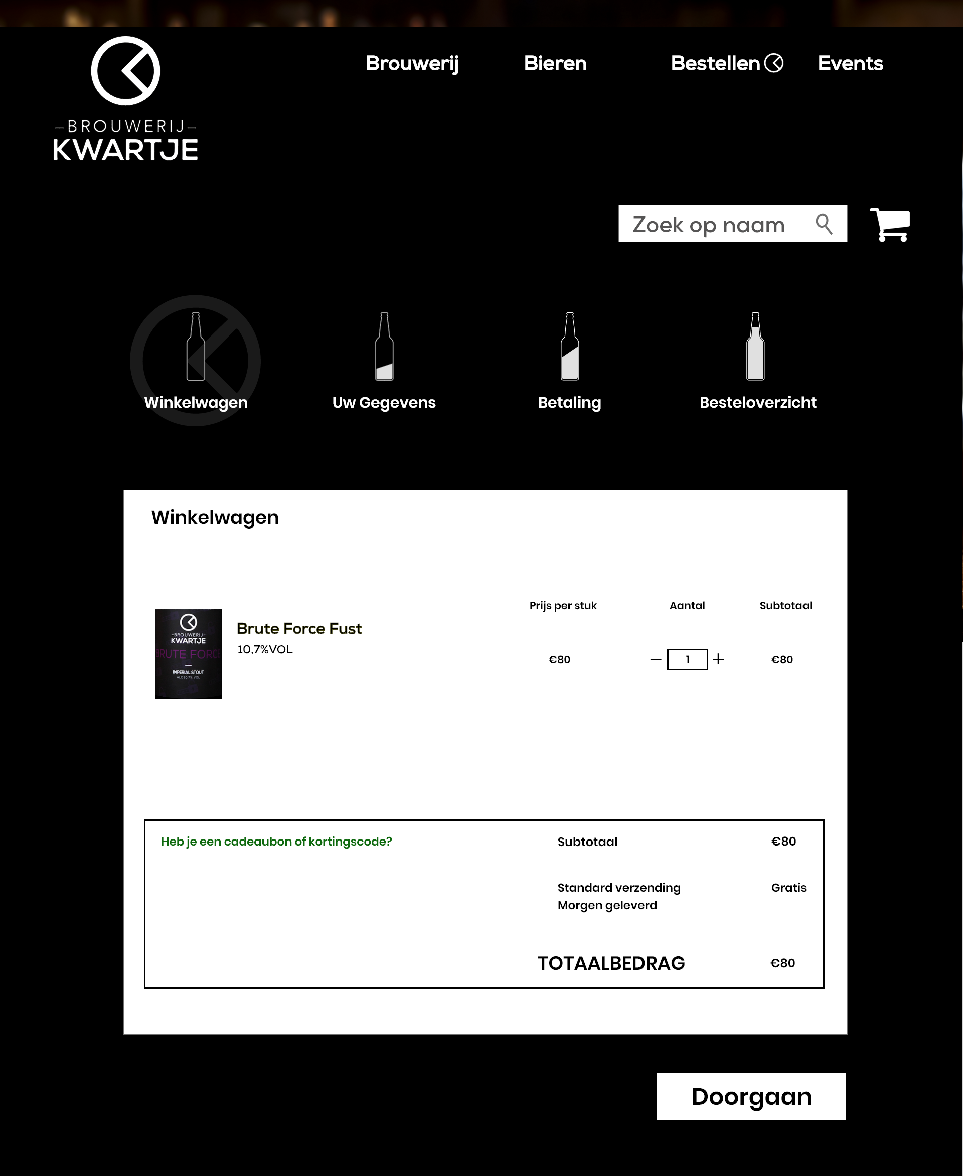
Refined screens.
The hi-fi pages reflect the final layout and interaction flow, combining functional structure with a simple, clean visual identity, all designed to support easy navigation.
Rebecca Leonora
Cases
"Design in progress.. driven by users, fueled by growth.”
Back to Designs
Redesigning the Local Beer Brewery Webshop
Tailored storytelling and sequence-based visuals.
Each beer type is presented with its own section and feel. The purchasing journey is visually mapped using sequences, helping users understand the steps with minimal confusion.
A detailed logic behind a working webshop.
A compact sitemap supported by a well-thought-out flowchart outlines all possible interactions. Every step, from discovery to checkout, was carefully designed and mapped.
Refined screens.
The hi-fi pages reflect the final layout and interaction flow, combining functional structure with a simple, clean visual identity, all designed to support easy navigation.